Increasing user loyalty for a leading fintech company
About
Smart app improvements for scaling a leading fintech company
A financial services organization, the largest payment network in Uruguay, wanted to enter a new market segment, and diversify their traditional in store payment service model. After creating an MVP with an external vendor, they not only validated product-market fit but also captured a significant market share in a short period of time.
After launching, and experiencing a boom in growth, the company decided to seek out an agile mobile development partner to take their mobile app to the next level.
Uruit signed on with the goal of improving both the user experience and performance, while adding new features to increase loyalty of the 800,000+ existing users, so that our client would retain its first mover advantage in the market.
The result is a new product; a prepaid card for those who do not meet traditional bank requirements. Clients can also deposit their salaries or social security benefits, as well as transfer funds, check their balance, and establish limits and alerts.

Challenge
Technical and Product Discoveries to build a better roadmap
Kicking-off this project required a deep understanding of its market, users, business goals, and existing code. We decided to run both Product and Technical Discoveries simultaneously.
Having validated that there was a market for its app, the client contracted Uruit to scale it. Without an in-house design team, the client relied on our UI/UX designers and developers with expertise in building successful mobile products to improve their app’s experience and usability. Product Discovery was essential to carry out an efficient project onboarding, to align our teams and identify and organize target areas for improvement. It also educated the client about Agile methodologies, which they sought to utilize internally in other projects.
We then moved forward with development. Our first challenge was creating a cross-platform app that could still perform well with older Android versions. We ran a Technical Discovery to review the existing code and architecture and to decide whether a full re-write was necessary. Our Full Scrum team organized work in sprints and focused on the user experience which enabled the client to meet a rapidly-changing market.
Solution
Smart app improvements to step up a fintech project
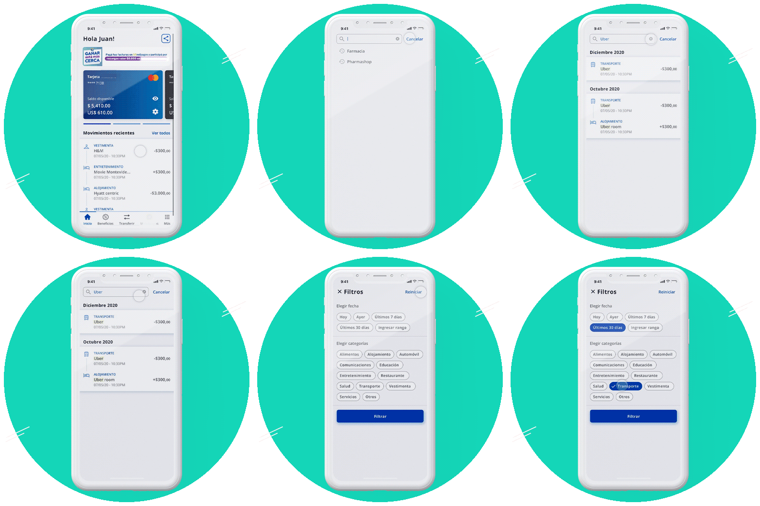
Based on the Discoveries workshops output, the team started working on the mobile app design and development, adding new functionalities such as account management options like balance checking and transfers, an integration with MasterCard solutions and others.
Soon after, we expanded our collaboration to other products under the client’s brand, such as a responsive web app that offered similar functionalities to the mobile product, and a web platform for other companies to use the solution to manage payments, salaries, employee information, and more. To get things started we held yet another Product Discovery workshop and focused on this new solution. All correspondence was 100% remote due to pandemic restrictions. Fortunately, we’re accustomed to working with distributed teams.
We were able to achieve a true collaboration at Product Strategy and Design. While the managers on the client’s side brought their business and industry knowledge, we complemented with our experience and UX best practices for evolving the app and making users happier.
As this project is part of a rapidly growing market that is in constant flux, using Agile methodologies has been ideal for organizing the development; retros and planning meetings have been useful for both parties and the iterative nature of the work helps the project move fluidly. Story mapping has also been an effective way of separating different lines of work and prioritizing tasks.

Results
Great UX design increases user loyalty
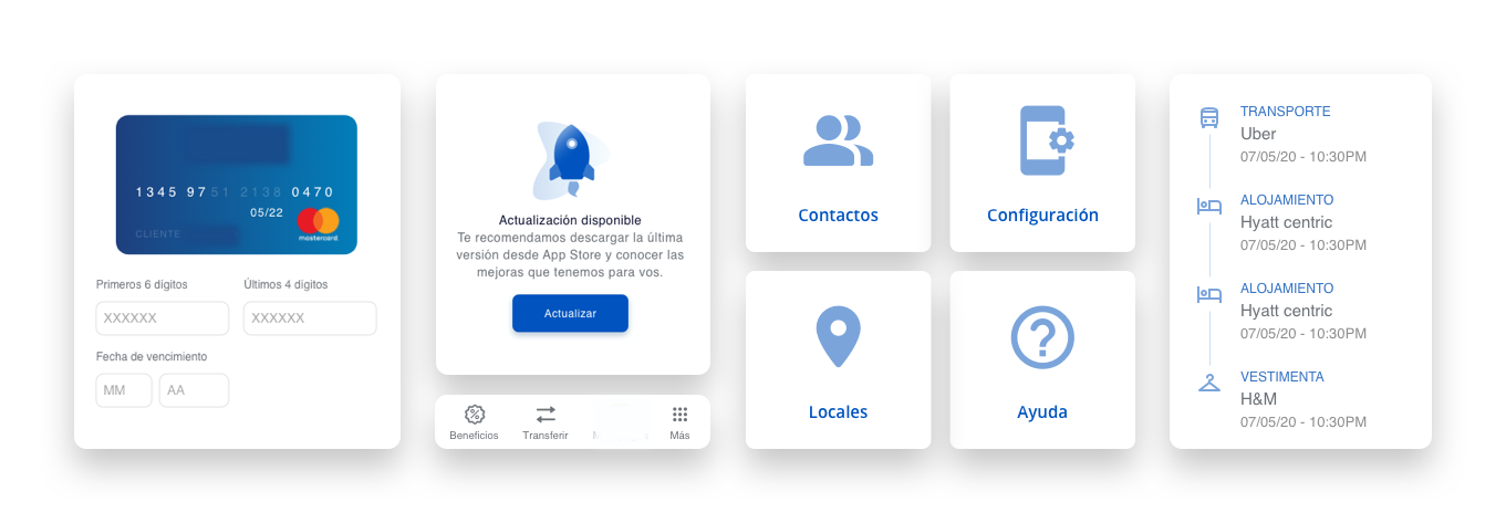
We’ve created a more stable version of the app, achieving the client’s goal of increasing user loyalty by offering a great experience focused on usability, since all of the communication and user flows were updated. From icons to buttons, from onboarding steps to accessibility functions, we’ve made significant changes to achieve a more integrated design and make sure users understand how to maximize product usage.
We fixed the app’s pre-existing performance issues and built a world-class app. Moreover, we’ve also collaborated to create similar versions of the mobile app with different brandings for businesses our client partners with.
This suite of digital solutions recently turned into an independent spinoff company, positioning our client as a leader in the fintech space and growing its user base by 20% in less than one year.
For this project, we assembled a custom core team that has grown and changed over time, to adapt to client needs. This flexibility and our solid relationship with our client resulted in a great partnership. We’ve become their primary partner for design-related decisions –they relied on us for all of the usability and user experience definitions in our latest project – and we helped in their familiarization with work methodologies that were somewhat new concepts, and are now working smoothly, maximizing time to market and enabling them to react quickly to a fast-changing financial market environment.
From innovative startup idea to successful unicorn company
Product development based 100% on user feedback takes a startup to the next level
From innovative startup idea to successful unicorn company
Product development based 100% on user feedback takes a startup to the next level

UX consulting for 5G camera platform focused on minimizing churn
Ad tech company provides solutions for major mobile carriers.
UX consulting for 5G camera platform focused on minimizing churn
Ad tech company provides solutions for major mobile carriers.

Digital transformation of a 40 year old business
Product Discovery project for the United States’ #1 life and business strategist
Digital transformation of a 40 year old business
Product Discovery project for the United States’ #1 life and business strategist

Mobile app redesigned for +30K telecom clients
Telecom giant's app ranks two stars higher on the App Store after redesign
Mobile app redesigned for +30K telecom clients
Telecom giant's app ranks two stars higher on the App Store after redesign

First responders app goes from desktop to mobile
Mobile development for software used in international events such as NASCAR and Boston Marathon.
First responders app goes from desktop to mobile
Mobile development for software used in international events such as NASCAR and Boston Marathon.

Health mobile app shines for its performance & design
One-week Product Discovery results in MVP and product roadmap.
Health mobile app shines for its performance & design
One-week Product Discovery results in MVP and product roadmap.
